


February 26, 2015
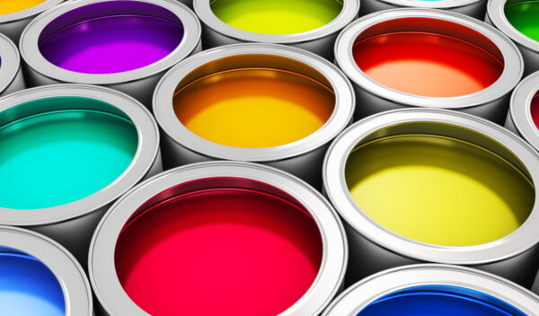
Colours Decorating IdeasColours are associated with different meanings, moods and effects which influence our perception of the external environment. The significance of each colour is often shaped by culture, individual preferences, experiences among many other factors. While these associations may vary, there are some generalities that are worth considering when creating a colour scheme to complement your décor.
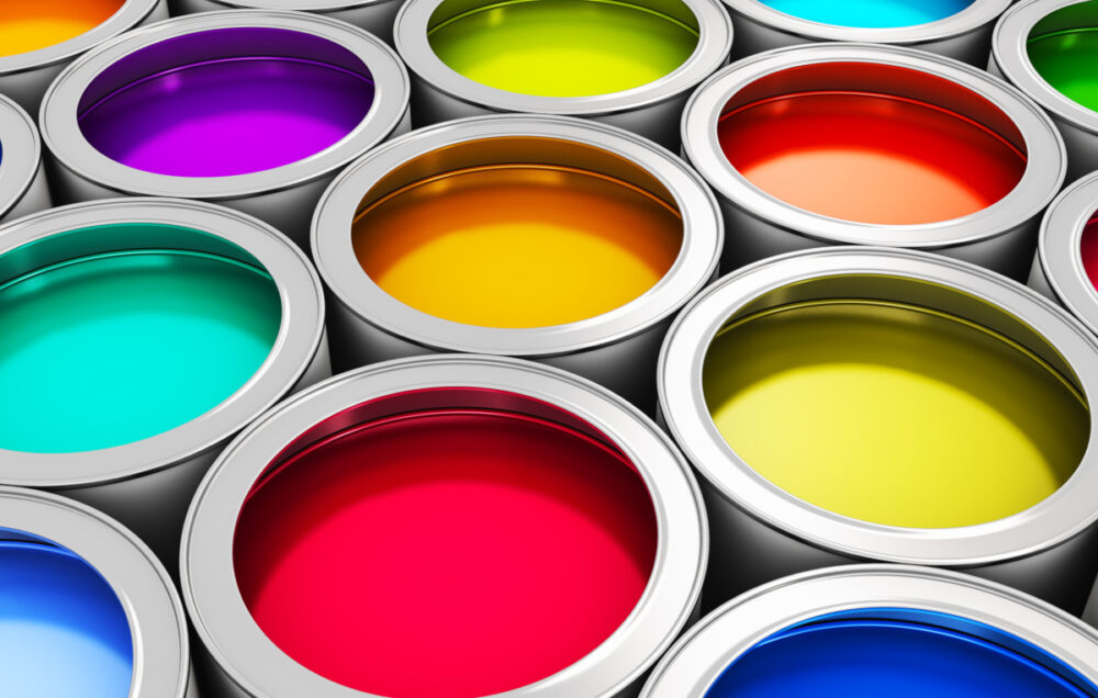
Colours are associated with different meanings, moods and effects. The significance of each colour is often shaped by culture, individual preferences, experiences, environment among many other factors. While these associations may vary, there are some generalities that are worth considering when creating a colour scheme to complement your décor.
The classification of colours based on their ability to have a specific impact within a given space can act as a useful guideline during the planning phase of any decorating project. This does not mean that individual preferences should be ignored. On the contrary coupling the impact of colour associations with personal identity can lead to more favourable results. Once you are clear on the mood you would like to create in a particular space identifying the colour or colours that will enhance it becomes a far more rewarding process.
Reds
Status: Active
Characteristics:
Red is associated with passion, energy and vibrancy. A room that is painted in red is thought to stimulate lively conversation and promote activity. The high impact of this colour can be too overpowering for a bedroom setting and is best placed in rooms that are used for entertainment purposes. If red is a particularly favourite colour and you wish to place it in your bedroom, then consider adjusting the lighting in the room so that the colour appears more toned down to promote restful sleep. Another great way to incorporate it in the bedroom setting is to use it on an accent wall directly behind the bed so that it does not affect sleeping patterns.
Where to Use:
- Foyer
- Living Room
- Family Room
- Dining Room
Complementary Colour: Green
Blues
Status: Passive
Characteristics:
Blue is considered a peaceful, somber colour that has the ability to create a relaxing atmosphere. The effect is further increased when tints of blue are used like light blue or baby blue. However, the overuse of blues can evoke a sense of coldness especially if extremely light pastel blues are used throughout a particular space. Deeper shades of blues have a similar effect however, be cautious when opting for a blue that has greyish tones, these may elicit feelings of dejection. To balance out the coolness of blue, combine it with its natural complement orange, which when used in small doses creates a naturally pleasing effect.
Where to Use:
- Bedroom
- Living Room
- Dining Area
- Hall Way
Complementary Colour: Orange
Yellows
Status: Active
Characteristics:
Yellow is often associated with happiness, brightness and a sunny day. It is best featured in the heart of the home – the kitchen. In this space it invites friendly communication and high energy. While the colour has a very positive association, particularly rich shades of yellow should be avoided in large amounts in rooms that are used for resting or relaxation. Lighter tints of yellow can be used more liberally than darker or more intense yellows. Vibrant yellows are best used on accent walls or in entry ways to produce an eye catching effect.
Where to Use:
- Kitchen
- Foyer
Complementary Colour: Violet
Oranges
Status: Active
Characteristics:
Orange is a powerful colour that elicits feelings of exhilaration and zeal. It tends to dominate any room because of its underlying composite colours red and yellow – colours that themselves are considered especially active. Because of its ability to easily overwhelm it is best used as an accent colour on a specific wall within the space or in accent pieces to highlight its natural complement – blue.
Where to Use:
- Living Room
- Dining Room
Complementary Colour: Blue
Whites
Status: Neutral
Characteristics:
White is associated with cleanliness purity, lightness and sterility. White is a neutral colour which blends well with all known colours. A room painted in white may seem overly sterile and boring if other elements do not help to balance out its plainness. It is ideal for use as a dominant colour when mixed with a slightly more interesting accent colour. Shades of white like bone white and antique white can help to create the illusion of space when used in smaller more restrictive spaces.
Where to Use:
Almost anywhere, especially when blended with more dynamic colours.
Complementary Colour: N/A
Blacks
Status: Neutral
Characteristics:
Black is considered a very masculine and sophisticated colour. It is often used in modern decors to add depth and give weight to certain objects. Black is not used on walls very often as a standalone colour. It is best utilized to emphasize accent pieces or to create pleasing patterns or effects in conjunction with other colours. An accent wall can be made even more appealing with the inclusion of black stripes. This is particularly effective when used with its perfect contrast – white.
Where to Use:
Anywhere in limited amounts to create depth and impact.
Complementary Colour: N/A
Purples/Violets
Status: Active
Characteristics:
Purple is an enticing colour that is associated with femininity, drama, creativity and spirituality. A room that is painted in shades or tints of purple will have a pleasing impact which can range from stimulating to relaxing. Deeper shades of purple are powerful and best used on accent walls or in accent pieces. The effect can be very pleasing when combined with muted tones of the same colour. Lighter purples are ideal for use in areas where relaxation is key without giving off a feeling of coldness.
Where to Use:
- Bedroom
- Living Room
- Dining Room
- Foyer
- Hallway
Complementary Colour: Yellow
Browns
Status: Neutral
Characteristics: Browns are associated with nature and togetherness. These are hues that are naturally very inviting and warm. Shades and tints of brown can be used liberally throughout a colour scheme depending on the atmosphere that you would like to create. Lighter browns will leave the space more open and blend more easily with other colours. Deeper browns will add a layer of coziness to your colour scheme and are perfect for family rooms and living rooms.
Where to Use:
- Family Room
- Living Room
- Dining Room
Complementary Colour: N/A
Greens
Status: Passive
Characteristics:
Green is the colour of prosperity, peace and rest. It is ideal for use in practically any room of the home because of its soothing quality and ability to promote relaxation. There are few shades of green that would not look inviting on an accent wall or when used throughout an entire room. A fresh yellow green or chartreuse is perfect for the kitchen area as it invokes feelings of happiness and creates a laid back atmosphere. A deeper shade of green is perfect for a formal living area which will appear regal yet inviting.
Where to Use:
Practically any room depending on the chosen shade or tint.
Complementary Colour: Red
Dark and Light Colours
The lightness or darkness of a colour can impact the depth and feel of any space. Lighter colours have a tendency to make a room feel more spacious. Darker colours add warmth and coziness. Avoid using very dark shades throughout a small room if your aim is to create the illusion of space.